How to use the Visualize tool
The Visualize tool in GTM Tools is designed to help you map, audit, and understand the structural relationships within your Google Tag Manager (GTM) containers. The tool takes a container's assets and turns it into a visual map. It automatically links related components together, so instead of manually cross-referencing which trigger fires which tag or which variable belongs to it, you can see the entire structure, and how everything connects.
If you are a freelancer or agency, you can use the map to easily present the container's architecture, demonstrating which triggers fire which tags and which variables belong to those tags. Also, it’s extremely useful for identifying "hermit nodes" – tags, triggers, or variables that aren’t linked to any other assets in the container. These orphaned items often indicate legacy setups, broken implementations, or redundant configurations that can be cleaned up.
How to use the tool
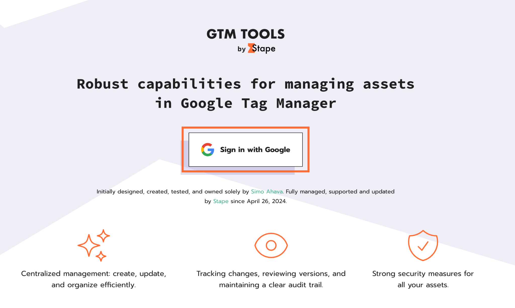
- Go to gtmtools.com and sign in with your Google account that has access to your GTM container.
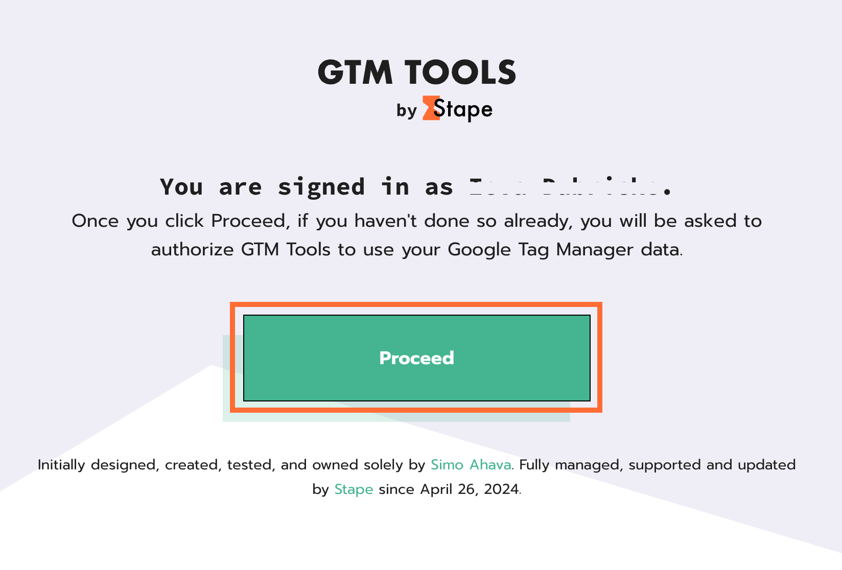
2. Click Proceed and allow the GTM Tools to access your containers.
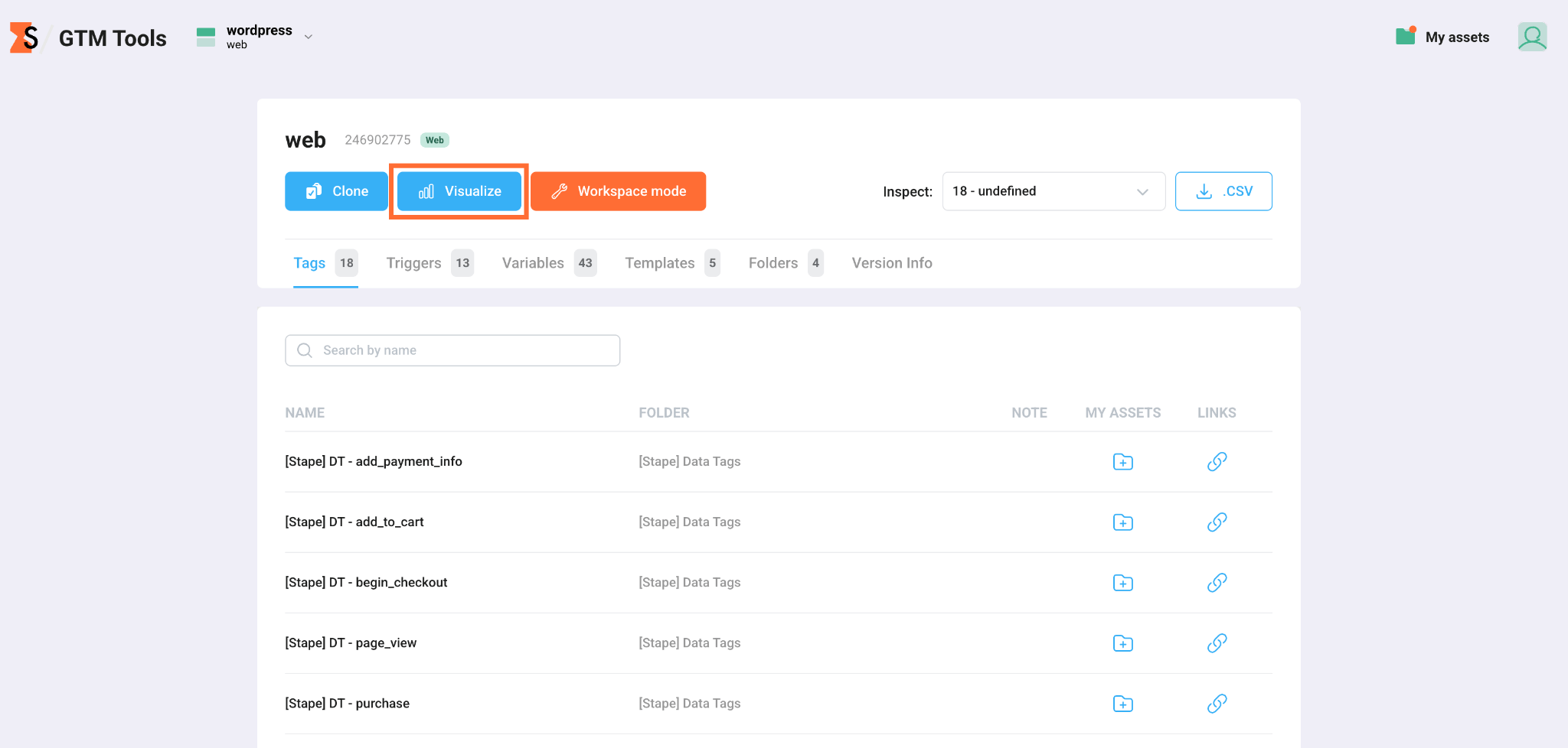
3. Click on the desired container.
4. Click Visualize.
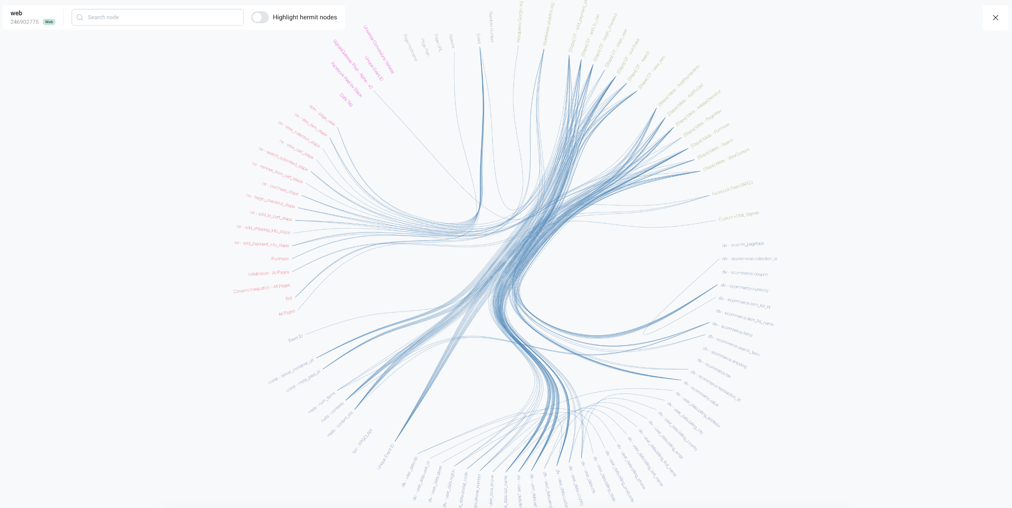
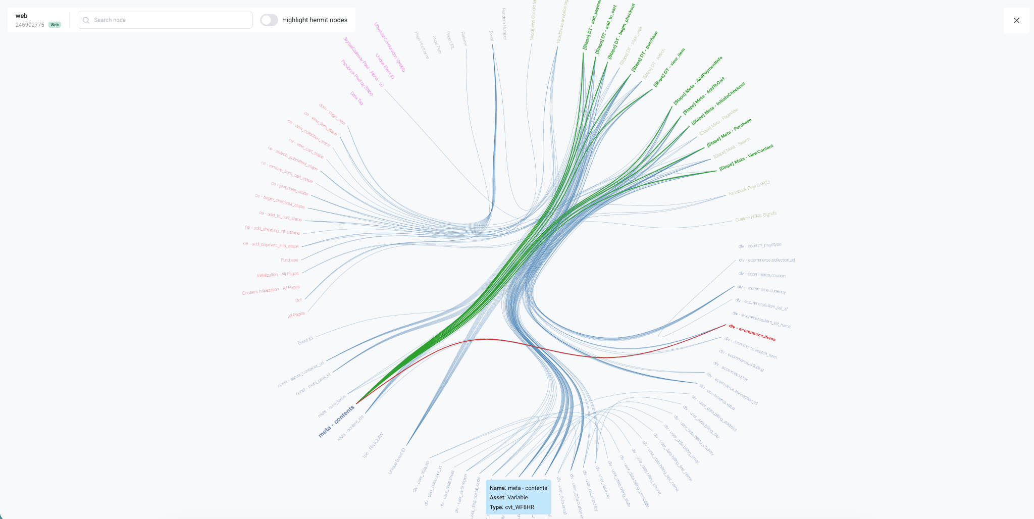
5. This opens the container's visual map, rendered as a circular network diagram. At the top-left, the container's name, ID, and type badge confirm which container you're viewing, alongside two controls:
- Search – locate a specific tag, trigger, or variable by name, which highlights it within the map.
- Highlight hermit nodes – a toggle that visually flags assets with no connections to anything else in the container, making it easy to spot candidates for cleanup.
The map itself arranges every asset around the perimeter of a circle, with each asset name color-coded by type (for example, tags, triggers, and variables each get their own color, such as pink, orange, yellow, or purple). Curved lines are drawn from each asset to every asset it's connected to – so triggers link out to the tags they fire, and variables link out to the triggers or tags that reference them.
6. Hover over an asset to see its relationship with the other assets. GTM Tools isolates that asset's connections and colors them to indicate the direction of the relationship – showing not just that the assets are linked, but which way the dependency goes:
- Red lines – represent inputs or dependencies of what goes into the asset you're hovering over. For example, hovering over a tag shows red lines coming from the triggers and variables that determine when and how that tag fires.
- Green lines – represent outputs or dependents of what relies on the asset you're hovering over. For example, hovering over a variable shows green lines pointing from that variable to the tags, triggers or variables that reference or use it.
A small tooltip also appears near the hovered assed, confirming its name and asset type, so you can be sure exactly which asset you're inspecting.
Was this article helpful?
Comments